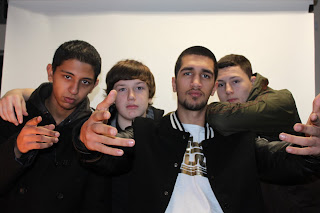
L2 photo Adil.
Friday, 1 July 2011
Monday, 21 March 2011
unit b diary assiment 2
today i filled out a portfolio sheet for my poster that im doing my idea has come some what from the movie blade. the pictures im going to take are were the villian and the character are both standing together facing each other or facing the camera, its going to leave the audience wanting more.
Monday, 28 February 2011
film posters lesson.
1. Is the movie title prominently featured? Is the text easy to read?
yes. dark colors attract attention.
2. Are the main actors shown? If so, which ones?
only one charactor is show and thats the villan in the film to show who the main charactor is targeting.
3. What is the design of the movie poster? Does it accurately reflect the mood and tone of the film?
yes as it gives off a horror mood, its a darker movie and people like dark movies, due to this poster it give off a curiosity feelings.
4. What other images are included? What do you notice about the framing of the images?
there is a fuzzy look on the poster making it look scary and standing out
5. What text is shown on the poster? Is there a catchy slogan? If so, what does it tell you about the movie's story?
6. Is there any other important information included on the poster?
the eyes of the villian stand out due to them being plain white and scary and that attracts alot of attention with it having blood shot around it
7. Why do/don't you think this movie poster is persuasive?
i think it is persuasive due to the mystery of the poster its dark and makes the audiance think, it attracts audiences without them relising it,
1. Is the movie title prominently featured? Is the text easy to read?
yes although the credits are small prints which are hard
2. Are the main actors shown? If so, which ones?
yes the hero if fetured on the poster with the villian faded out in the background
3. What is the design of the movie poster? Does it accurately reflect the mood and tone of the film?
yes dark colors with weapons shown to show its a action horror film
4. What other images are included? What do you notice about the framing of the images?
smart idea as the hero is the main aspect of the poster although behind him faded out is the villian with angry face expressions,
5. What text is shown on the poster? Is there a catchy slogan? If so, what does it tell you about the movie's story?
no catchy slogan but the text that the name of the film is made in is stylish and thats the only thing thats here which is a bad point as its not as catchy if you 1st look at it
6. Is there any other important information included on the poster?
effects are very well done
7. Why do/don't you think this movie poster is persuasive?
i dont think it is as it dont feature alot of things that the audience will find intresting. i think more could have been done for this poster to stand out and be attractive.
Monday, 14 February 2011
photoshoot 9th/feb/2011
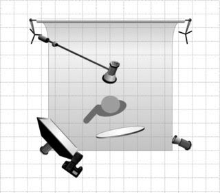
on this day we were experimenting with a photoshoot and as you can see from the picture we used different lights such as the soft box, the model light and the snood (back light) the soft box fills in the shadows, the main light is the sorce of the light and the backlight helps to not make the picture look flat. these are some of the example pictures that we took.
Monday, 7 February 2011
31st / 1 / 2011
Monday, 6 December 2010
evaluation of little people
1. What are you thoughts on the finished product:?
my thoughts on the finsihed product on the whole are that im happy with the work i have produced and i think that the changes that i made benifited me in the end. i feel like the work that i did look good enough to represent the college if chosen to do so. in spercificly i like my little person on the moped on the back of a car, as its a little humerus.
2. Does it look how you originally planned?
its not what i originally planed but it sort of does although due to some of the changes that i made think made it better than my original plan,
3. What do you think about the qualities of your work? In Focus, Good bad light
i think the qualitie of my work is good, i think the focus was just right with the lighting, my pictures are focused on the little people and what they are doing so its not bluring or anything else, also i havent use too much bluetac to stick my little people down i used just enough to not let it be visible.
4. Give your ideas about comments from others, eg audience, peers, tutors, client
the comments and feedback that i got i will take on board what my fellow peers have said and what my tutor has to say about my work, i think the more i listen around and adjust my work the better qualitie of work i can produce and the better i produce the more attention i can get.
Monday, 29 November 2010
Exhibition
Where to hold the exhibition?
The exhibition will be held at central Sussex College at 1pm till 2pm in room T42.
How might it look?
There will be different types of examples handed out to attract them more towards the work shop which will be in the corner for anyone to try and see what type of work we do and see the skills they have that they did or didn’t know about.
Who to invite?
Looking to invited members of college who are looking to getting into media and also other people from outside college who are also looking to get involved and looking to take up media in the following year,
Titles for the photos?
Depending on which model they use on which thing the name of the titles will change, although the main title for the workshop is the things you could do with little people.
Subscribe to:
Comments (Atom)


